Basecamp’s design – a cheap analysis
Actual publishing date: Jan 12, 2022
👋 Hey everyone!
I knew about Hey mail some months ago. I remember to really like the idea but since there was no native apps for both phone or desktop, I kept avoiding it. I have a certain resistance for Electron and web view apps but also an admiration since I’m myself a web dev.
Electron and web view apps are basically apps that emulates a browser and only runs a specific site. So you’re not running a native app, you’re using a browser (with, sometimes, some native elements here and there).
But recently I started to want it again and then I finally signed it. Loved it. But there’s something else that always bothered and intrigued me: the design. Not only for hey, I mean basecamp’s design, the design style of the company.
It’s not exactly beautiful, but it’s someway exciting and for some reason makes you wanna use the product. It’s functional but not only functional (linux design are usually only functional), it’s fun and cute!
I still don’t know exactly how to explain the thing, but I’ll share some thoughts.
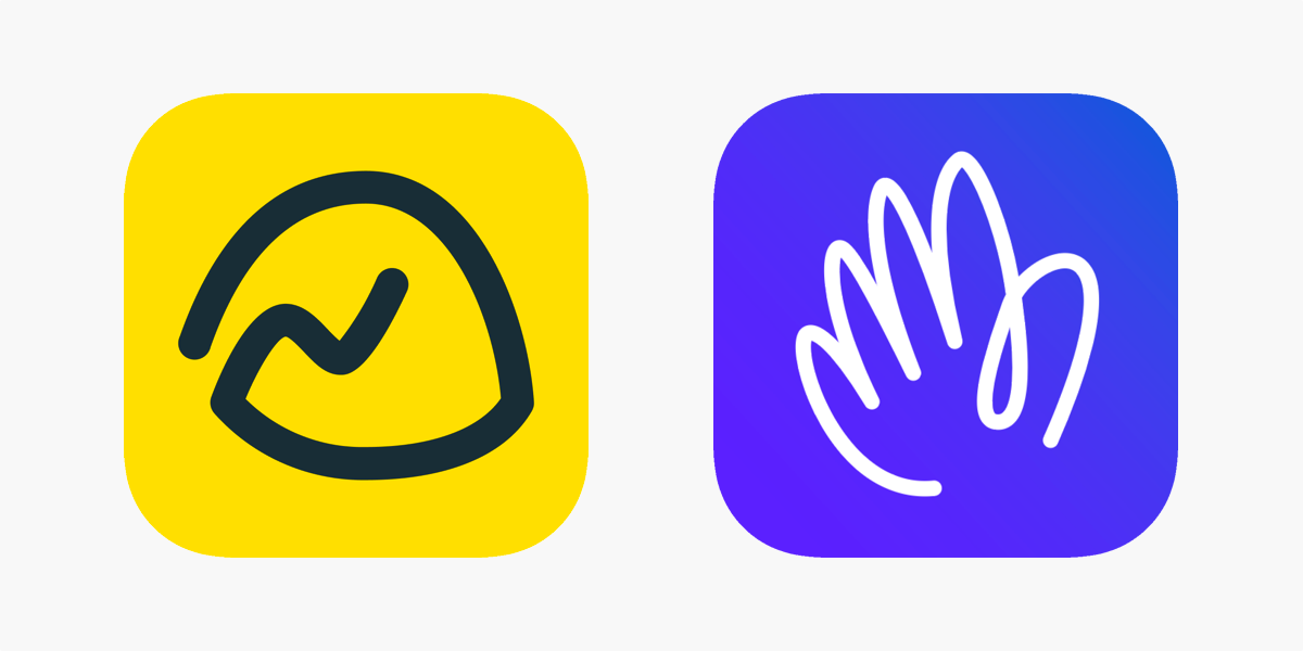
The logos are extremely well thought and built. The colors are sweet and enjoying and the hand drawn style makes both apps feel really fun to use. I keep opening Hey app just because the whole thing feels fun to use.
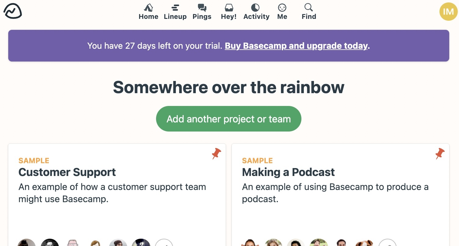
Look at this, it’s a pretty cheap design. Minimal, clean, but kinda cheap. Nothing is too fancy, but again, I want so bad to manage or be in a group that uses it because man, the fucking chat is called CAMPFIRE. That’s so freaking cute!!!
Another curious little thing I found, the cover art in Hey apps: (It’s a 18mb gif, so it might take a while to load :X)
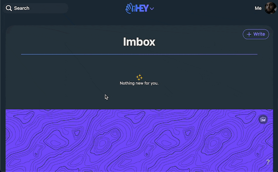
Man, it’s an image, bigger than your screen (cause you can even scroll it), that covers the read emails. What a stupid and brilliant idea! It’s so weird and yet so colorful and somehow cute that you end up using it and really enjoying hiding and showing it.
Other than UI, their language is pretty casual and straightforward, always showing a strong passion for what they do, speaking with property and building really opinionated apps (so opinionated you can’t receive a notification for new mails in your screener, and I enjoy it too 🤡). They’re so sure what they’re doing they even wrote a book called Shape Up: Stop Running in Circles and Ship Work that Matters.
I wanted to write a little more, but I think a long newsletter is always boring to receive/read. I guess the core idea is to have a small stalk everyday about cool things :)
Yeah I think this is it.
Thanks for reading!
Oh, did you know you can give a feedback about the newsletter just by answering the email? I’d love to receive that 💌
Here’s a wallpaper: